Look at the following logos and explain in your own words what you consider identitty to be.
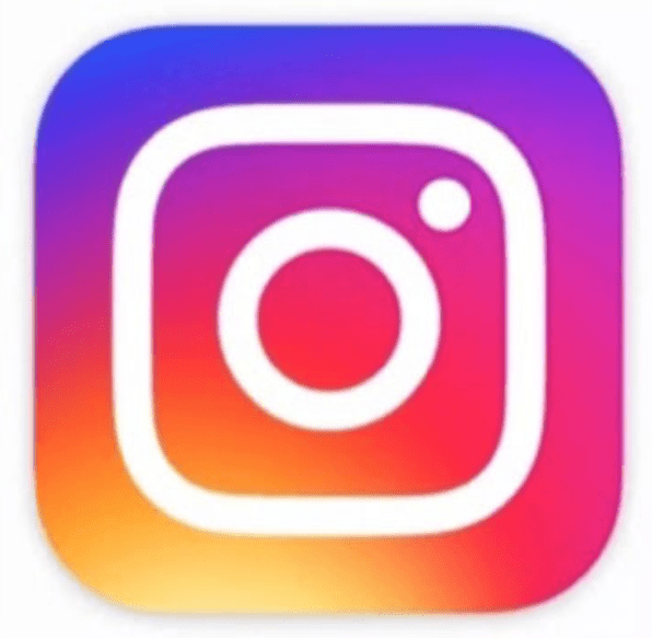
Instagram.
Instagram is a photo ans wideo shering platform, By looking at the colours that is the fist thing that put my eyes on the logo. I think that use of this colours is well thougt. Purple is a colour tahat represent creativity, passionate,confident and vise among sevrel other. Blue represent: Balace, vise,thoughtfull, intelligence among servel other.Red represent: fysiøcal, active,powerfull,practical, honest and down to earth.orange represent:Sharming, nice, friendly, creative, loves people, loving.Yellow represent kind, happy, optimistic,thoughtfull, pelight,curius and lovable.
I think that the colours is put together to show that this is a place for everybody, no mather how you are or who you are. The gradient used in the colour blemding makes the Logo look eye-catching.
Lets look at the logo, in the logo i can se a type of camera, it remindes me of a polaroid camera that can print the piqtures right away. I think that instagram at first was created for mobile devices, so that the users could take the piqture and put it in instagram right away.

Mercedes Benz.
The star in this logo is classy, clean, it leaves a feeling of quality and class.To me mercedes is a sign of luxury. By looking at the star i would think that ther could be more than one meening behind it. I think that it means that this identity fits in as a star as a visual effect of the high quality of this brand. I got the feeling that the star has a deeper meaning, as the star is pointing in three different directions. But the directions is a mystory to me.

Marstercard.
To start with the colours in this Logo. The red colour means Will, heat, stubborn, generosity. The orange colour means Happiness,joy of life, enthusiasm and amusement. The Yellow colour means optimism, intellect, acumen and mental skill. I think that all of this meanings represent the costumer and the identity of this card. To me it seams like a lot of the promises comes to meaning in the choise of colour. I think of this as a shopping card. The two sircels could remind of two coins to illustrate that this is the card according to the colours is one of the bank and one of the costumer, that blend together.
